What bookmakers data tells us about Euro 2016
The final game of Euro 2016 is going to be played today so it’s a good day to look back and see how tournament unfolded. When the tournament began I decided it will be interesting to track how bookmakers viewed the contest. Which team was the top favorite to win the tournament? How did odds of each team evolve over time?
To answer these questions I decided to keep track of bookmaker website and see how their predictions will change over time. Bets I’m interested in were displayed each day on this page here. I snopped around looking using chrome Chrome developer tools, checking requests they sent to fetch predictions. Turns out their page is usual JS app that uses Ajax requests to download content in the background. Looking into dev tools odds for winner are pulled from following endpoint with a simple GET request.
There’s only one request to fetch all teams odds of winning, writing script to parse this is rather simple. Just need to make one GET request to ladbrokes, parse json and save it into sqlite database. Script I wrote to accomplish those tasks is available here.
I set up my script to run as cron job every day in the morning from my virtual private server. I started collecting data on 14-06-2016 and it was running until today. If you’d like to view the data, all the information I gathered is here in .csv format. Csv file contains following columns: name of the team, date data was extracted from bookmaker, date when bookmaker updated their odds, odds as decimal number, odds as fractional number.
So now to most interesting question, how did odds change over time?
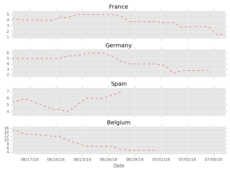
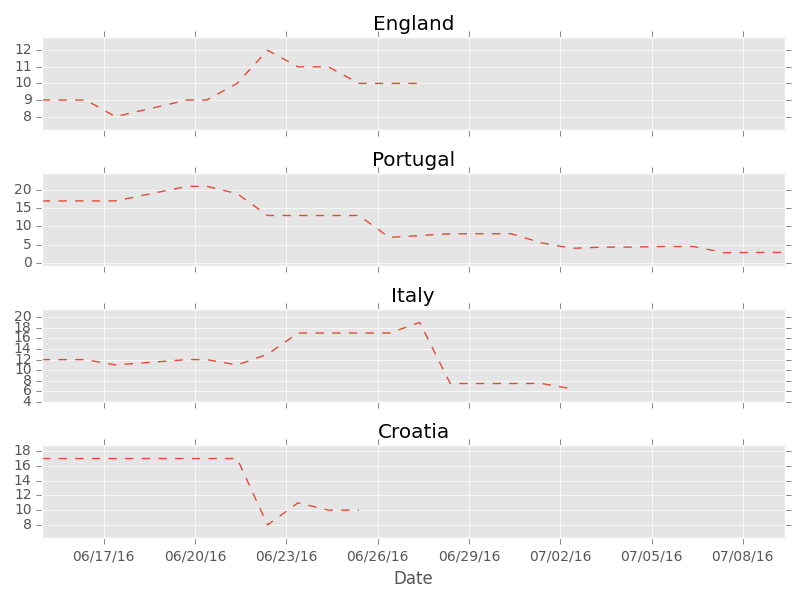
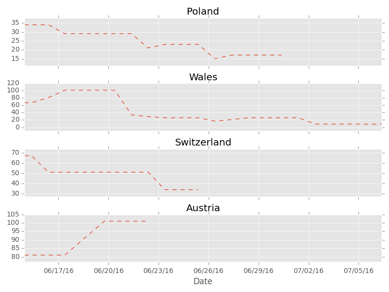
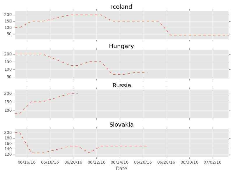
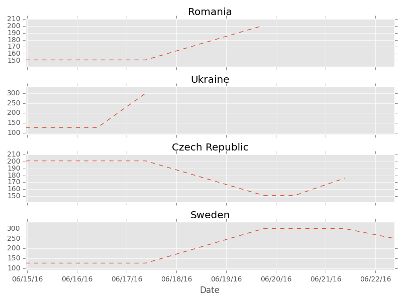
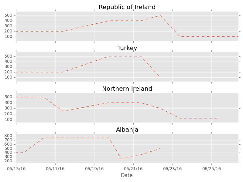
You can see whole tournament in those plots. Ups and downs of each team are reflected in their decimal odds. Look at Spain for instance, predicted chances of winning go up after impressive win with Turkey, but couple of days later they become smaller because Spain looses with Croatia so it appears they are not in best form. Then it turns out Spain will play Italy in 1/16 so their odds are higher again. Finally they are out so the line ends there.
It’s pretty interesting if you ask me. Hope it’s interesting for you as well.
If you’re interested how I generated those plots the code is here:
import os
from datetime import datetime
import dateparser

import pandas as pd
import matplotlib.pyplot as plt
import matplotlib.dates as mdates
from pylab import savefig
from itertools import izip_longest


def grouper(iterable, n, fillvalue=None):
    args = [iter(iterable)] * n
    return izip_longest(*args, fillvalue=fillvalue)


plt.style.use("ggplot")
data = pd.read_csv("euro.csv")
data["date"] = data.registered_db.apply(lambda x: dateparser.parse(x))

all_teams = data.groupby("team_name").decimal_odds.mean()
all_teams.sort()
all_teams = all_teams.keys().values

date_formatter = mdates.DateFormatter("%D")


# create 8 plots each one with 4 teams
for y, team_chunk in enumerate(grouper(all_teams, 4), 0):
    fig, ax = plt.subplots(len(team_chunk), sharex=True)

    for i, team_name in enumerate(team_chunk, 0):
        team_data = data[data.team_name == team_name]
        ax[i].plot(team_data.date.astype(datetime), team_data.decimal_odds, "--", label=team_name)
        ax[i].set_title(team_name)
        ax[i].xaxis.set_major_formatter(date_formatter)
        # try to adjust y axis range so that all lines are clearly visible
        total_range = max(team_data.decimal_odds) - min(team_data.decimal_odds)
        total_range_to_adjust = total_range * 0.2
        ax[i].set_ylim([min(team_data.decimal_odds) - total_range_to_adjust,
                        max(team_data.decimal_odds) + total_range_to_adjust])

    fig.subplots_adjust(hspace=0)
    plt.xlabel("Date")
    plt.tight_layout()
    filename = "euro{}.png".format(y)
    savefig(filename)